 Amaryllis flower
Oil on canvas
23x27 cm
This is one of the two paintings I made last weekend. Haven't had the time to post them until now. I was experimenting with different color palettes and focusing on keeping within one part of the color wheel. So I started out with some reds and yellows and I was so inspired by the Amaryllis flower still blooming in the window, lit from the back so the petals became see-through and the long leafs projected soft shadows through the layers.


I started out with the foreground, rapidly blocking in the shadows and highlights. I was painting so fast I didn't even stop to take a photo. All in all I don't think this painting even took more than 3 hours, I was too much caught up in the moment. Then I sketched up the background in Flesh Ochre, keeping it undetailed and diffuse. I filled in the blank areas with Titanium White just to get the same oiliness to blur the edges into each other.
The small picture to the right was taken in the evening. And since there's almost no daylight these days I have no good light for my "in-process-nighttime-photos". Tried my best to get the yellows out in Photoshop. But what I actually wanted to show in this second process picture was just that there was too much yellow. Since the background was made with Titanium White and the foreground had transparent Stil de Grain-yellow with the canvas showing through, there was to much of a contrast. So I blended in some Titanium White in the foreground as well, using it as a higher value of highlight and I think it balanced out the painting in a good way.
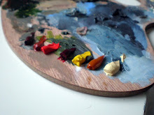
So I was very happy with this painting that came to me so quickly last Saturday morning, barely had time to think while painting it. These are the colors I squeezed out on the palette:
 From left to right: Burnt Sienna, Flesh Ochre, Permanent Red Medium, Madder Lake Light, Permanent Yellow Light, Stil de Grain Yellow, Nickel Titanium Yellow Deep.
I never used the Permanent Yellow much, but the Stil de Grain is lovely to work with, I just love the smooth texture and transparency.
A little later the same day I wanted to stick to the blue scale of the color palette. So I sketched out a giraffe and started out with the background first this time. Just applying dabs of paint in the grass, then working with downwards strokes only, which made it look almost as if it was raining. I had a lot of fun studying the pattern of the giraffe skin, never realized it was so much like mosaics before.

Rainy Day on the Savannah
Oil on canvas
23x27cm
Featuring: Olive Green, Sap Green, Ultra Marine Deep, Payne´s Grey, Prussian Blue, Indigo, Kings Blue, Naples Yellow Green. Some less used than others.


The only thing I regret about the giraffe painting is that I didn't paint it on a differently proportioned canvas. I would have liked to have had a taller and more narrow canvas to emphasize the slenderness in the giraffe's neck. And the color scheme is a little new to me, I keep thinking that the colors are too bright and vivid with the ultra marine and all. I'm used to a more toned down kind of palette, but I guess it just takes some getting used to.
Started signing my paintings this time. Haven't done it before because I never thought of them as finished. But now I realize that I might not continue with some paintings, even though they have come pretty far along, and later on I would like to remember what year I made them.
And I really HAVE to install the rest of the memory on my computer this weekend! Running Vista on 1gb of RAM is painfully slow. I'm so used to my ultrafast computer at work that my laptop drives me insane at the moment.

2 comments:
These are wonderful! Thank you for sharing. It taught me that sometime it is much better to limit colors only on one hue.
Yeah, like a black 'n white only in colour. Noir de couleur.
Hey Nina - Nice title.
Post a Comment