Wednesday, January 21, 2015
Wednesday, July 8, 2009
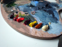
Hazy Harbor

Hazy Harbor
Oil on canvas
40,5x33 cm
Oil on canvas
40,5x33 cm
Wow, it's been a while now! I just finished off my year of being an intern at an architect firm and I really haven't had the time to focus on painting for a longer time while working full time. But now its summertime and that means back to business!
I am posting one of the paintings I've finished in the last couple of months above, just to prove that I haven't been away from painting completely. It is a harbor in my neighborhood, sort of. Had a lot of fun painting the reflections of the sun in the water (yes it is daytime but with the indigo could also be night). And I like it when the red underpainting shows through.
Yesterday I invested in new art supplies and got myself some new canvas that should result in at least four new paintings. Bought some new oilpaint as well, Sap Green, Cinnabar Green Light and Phtalo Turquoise Blue.
In process of mounting the canvases on the frames.. or what is the word for the kind of frame you wrap the canvas around?

And here is the final result, four canvases ready to be painted on!

Friday, January 16, 2009
Hues in Reds and Blues
 Amaryllis flower
Oil on canvas
23x27 cm
This is one of the two paintings I made last weekend. Haven't had the time to post them until now. I was experimenting with different color palettes and focusing on keeping within one part of the color wheel. So I started out with some reds and yellows and I was so inspired by the Amaryllis flower still blooming in the window, lit from the back so the petals became see-through and the long leafs projected soft shadows through the layers.


I started out with the foreground, rapidly blocking in the shadows and highlights. I was painting so fast I didn't even stop to take a photo. All in all I don't think this painting even took more than 3 hours, I was too much caught up in the moment. Then I sketched up the background in Flesh Ochre, keeping it undetailed and diffuse. I filled in the blank areas with Titanium White just to get the same oiliness to blur the edges into each other.
The small picture to the right was taken in the evening. And since there's almost no daylight these days I have no good light for my "in-process-nighttime-photos". Tried my best to get the yellows out in Photoshop. But what I actually wanted to show in this second process picture was just that there was too much yellow. Since the background was made with Titanium White and the foreground had transparent Stil de Grain-yellow with the canvas showing through, there was to much of a contrast. So I blended in some Titanium White in the foreground as well, using it as a higher value of highlight and I think it balanced out the painting in a good way.
So I was very happy with this painting that came to me so quickly last Saturday morning, barely had time to think while painting it. These are the colors I squeezed out on the palette:
 From left to right: Burnt Sienna, Flesh Ochre, Permanent Red Medium, Madder Lake Light, Permanent Yellow Light, Stil de Grain Yellow, Nickel Titanium Yellow Deep.
I never used the Permanent Yellow much, but the Stil de Grain is lovely to work with, I just love the smooth texture and transparency.
A little later the same day I wanted to stick to the blue scale of the color palette. So I sketched out a giraffe and started out with the background first this time. Just applying dabs of paint in the grass, then working with downwards strokes only, which made it look almost as if it was raining. I had a lot of fun studying the pattern of the giraffe skin, never realized it was so much like mosaics before.

Rainy Day on the Savannah
Oil on canvas
23x27cm
Featuring: Olive Green, Sap Green, Ultra Marine Deep, Payne´s Grey, Prussian Blue, Indigo, Kings Blue, Naples Yellow Green. Some less used than others.


The only thing I regret about the giraffe painting is that I didn't paint it on a differently proportioned canvas. I would have liked to have had a taller and more narrow canvas to emphasize the slenderness in the giraffe's neck. And the color scheme is a little new to me, I keep thinking that the colors are too bright and vivid with the ultra marine and all. I'm used to a more toned down kind of palette, but I guess it just takes some getting used to.
Started signing my paintings this time. Haven't done it before because I never thought of them as finished. But now I realize that I might not continue with some paintings, even though they have come pretty far along, and later on I would like to remember what year I made them.
And I really HAVE to install the rest of the memory on my computer this weekend! Running Vista on 1gb of RAM is painfully slow. I'm so used to my ultrafast computer at work that my laptop drives me insane at the moment.
Thursday, December 25, 2008
Blue Carolina

Blue Carolina
cropped
original 33x41cm
Oil on canvas
cropped
original 33x41cm
Oil on canvas
Finally on vacation for the holidays and I stayed up until 3 in the morning last night to paint this piece, took me about 5 hours. This is my friend Carolina whom I used to practice portrait painting that I haven’t done too much. I like it a lot and would love to do it more. I find it interesting to go into the facial features. You have to be so careful because one stroke can change the whole face and it might not look like the same person anymore, or the expression might change completely. The following pictures shows the painting process, starting off with a pencil sketch.


Sunday, October 19, 2008
Fall dreamings

Fall dreamings
46x55 cm
oil on canvas
I´m finally back with a new oilpainting! I was sick almost all of september, couldn´t even eat for 12 days straight, it was awful. Went to the doctor so many times I stopped counting. So it took a while to gain back my strenghts, getting back to work and finally finding my way back to the painting.
Today is a beautiful fall day and I´ve been wanting to capture the fall feeling in a painting for a while now. So I´ve been taking lots of pictures of trees changing colors thinking about painting them. But instead I ended up using an old canvas that I had scrathched on with charcoal when I was only 2 years old. That made me start painting more freely instead of using any photograph as a reference. Used the color combination of indian yellow, sap green and alzarin crimson, sometimes blending them and sometimes using them more on their own.
I was trying to paint less controlled, letting brush strokes stay more often instead of working over them too much. I used my old charcoal lines as branches for trees. Funny thing to be "continuing" on something I did such a long time ago and don´t even remember drawing!
I´m putting up the whole series of photos I took of the painting in progress. I think the sky and trees still need some more work but I´m really happy with the light and shadows of the trees on the ground and with the bushes in the foreground.


Saturday, August 30, 2008
New job and recent paintings
 Oil on canvas, 3st 10x10x4 cm
This week has been full of new impressions and changes since I just started my new job this monday as an intern at an architecture office. I got to start one week early since they had so much to do there, and that worked out fine for me.
After we came home from Gotland I had been practicing some new techniques with my aquarelles that I brought, and I´m starting to like it more and more. But I can never really keep away from painting in oil for too long, so here are some new ones I´ve been painting on recently.
I added color on the three landscape pieces (above) last week and I´m really happy with the result in color! I did it over and over a few times to get the color I wanted. It turned out to be a mix of Paynes Grey, Yellow Ochre and Burnt Ochre, in various proportions. The sky is Payne´s Grey (my new favorite blue color!) and white, with the reddish under painting showing through.
 Oil on canvas, 40x40 cm
Here is another recent one. I was experimenting with the light and the texture of the field. Colors used are Indigo, Payne´s Grey and Burnt Umber in the sky. And in the field: Indian Red, Burnt Umber and Indigo.
Saturday, August 9, 2008
Trying to get back to drawing

Since last week I decided that it was time to start drawing again. I have been painting so much that I thought I shouldn't forget about drawing. And also because I really want to apply for an architecture scholarship that I found out about, where you have to send in pieces of your work (only black and white!).
Then hopefully I can do a field trip around Europe next summer with the purpouse of learning more about building houses in an enviromentally friendly way. That is something I unfortunately haven't paid much attention to in my three years in architecture school. And it's surprisingly not really a big matter in the education so you sort of have to specialize in that yourself. So I thought it was about time for me to put some focus on a really important topic like that.
I began drawing without a real purpose, to take some pressure away and get the process started. Did these sketches of my livingroom just for fun. And even though the apartment was kind of cluttered at the moment, it was fun because there were just more objects to draw! Makes it more interesting with all the details, like a random still life. And imagine a photograph of the same thing, that would not say anything at all, just that I have a messy apartment.

But I couldn't keep myself from painting for long, I found this really inspireing article about underpainting and the wipe-out method on the blog of Jennifer Phillips. And then I was boosted with creativity for the rest of the day to paint and wipe out rolling landscapes with only one "color". Just playing around with the shapes, compositions and especially the lights and darks, I was really enjoying myself. (Obviously influenced by Jennifers works.) Couldn't really get the best underpainting mixture so I ended up mixing all the "earth tones" on my palette to use them up. So now it kind of looks like I was painting in chocolate, but I like it. Will be interesting to see if I dare put some paint on top of this. Oh and also, I painted on this 3d-canvas for the first time so I made the landscape go around the edges too, in case you see it from the sides.
 Three 10x10x4 cm - oil on canvas
Also I took out an old moleskin book full of my drawings from Portugal to inspire me to draw again. We went there first year of school in 2006. Our teachers gave us all a book and said as a joke that we had to fill them. But me and a friend were up for the challenge and really pushed ourselves to fill every page. And it looks really nice when you pull out the pages like an accordion and look at the drawings all together. Unfortunately I can't find this type of moleskin book anywhere, so I hope they didn't stop making it.


Going off to the island of Gotland now for a week, will hopefully come home with more drawings and photos of reference for painting!
Subscribe to:
Comments (Atom)